17.02.2025 - 09.03.2025 (Week 3 - Week 5)
Gunn Joey / 0366122
Information Design / Bachelor of Design (Hons) in Creative
Media
Project 1&2: Animated Infographic Poster
TABLE OF CONTENTS
1. Module Information Booklet
2. Projects
3. Feedback
4. Reflection
MODULE INFORMATION BOOKLET
PROJECT 1&2
Requirements
Your main intention is to analyse the “delivery mechanism’s” that
affect the outcomes of your infographics. Though content is
important, however the aim of this presentation is too look at
what makes an infographic presentation work or does not work. This
includes content but only as one of the many components of an
infographic:
PART 1: Infographic poster (10%)
Instruction:
1. Choose 1 infographic poster reference from Internet (Please
consult before proceed)
2. Redesign the poster into A4 size. Sketch the idea and
process
3. Redesign and simplify the poster based on visual hierarchy
& typography
4. Simplify the poster's design based on color, shape &
pattern
5. Attach your final poster on E-Portfolio with explanation and
reflective writing
PART 2: Minimal animated infographic (10%)
Instruction:
1. Animate your infographic poster into one static loop animation
page
2. Loop duration in between 15-30 second
3. Size: 1080 x 1920 px (Vertical Video) upload to own Youtube
channel
Submission:
1. Digital upload into Google Drive.
2. Online posts in your E-Portfolio and reflective writing.
Project 1: Infographic Poster
A. Poster Selection
I consulted Mr. Shamsul regarding a few of my topic ideas for Project 1. After
discussing the options, he suggested that I go with the topic "Why Am I
Sleepy." He explained that this topic is more suitable for redesigning into an
infographic poster, as it offers clear and relatable content that can be
effectively organized using visual elements. His feedback helped me decide on
a direction that would work well with the design requirements and allow for
more creative and informative visual storytelling.


B. Visual Reference
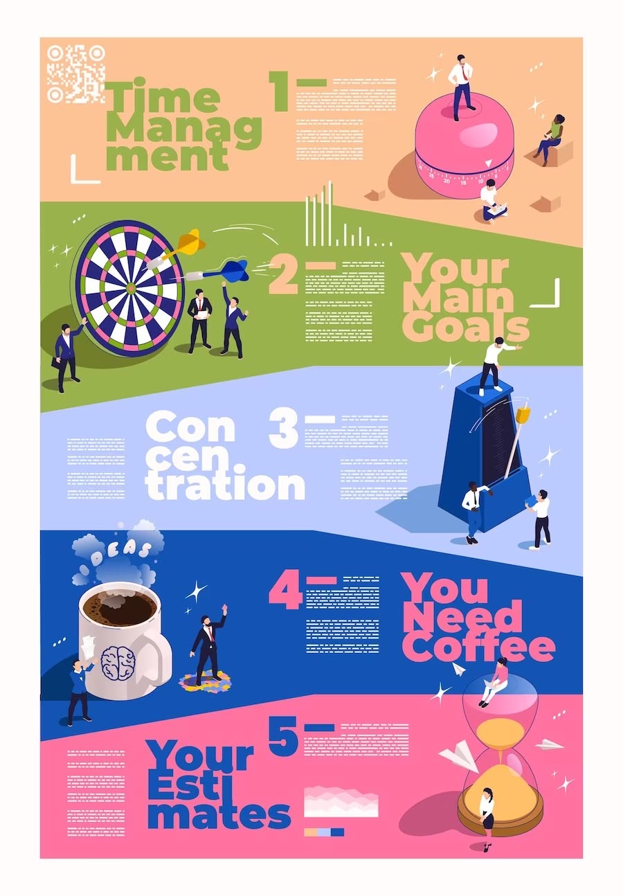
In Week 4, I presented Mr. Shamsul with two infographic poster design references that were similar in style. He mentioned that both references were well-executed and served as good sources of inspiration. However, he advised me to avoid directly copying the design. Instead, he encouraged me to create my own unique layout while using the references as a guide for structure and style.

C. Ideation Sketch


D. Digitalisation
Fontbook:
I downloaded two fonts from Google Fonts because I wasn't fully satisfied with
the default font options available in Adobe Illustrator. To use them in my
design, I imported the fonts into Font Book, which allowed me to access and
apply them to my infographic poster. This helped me achieve a more suitable
and visually appealing typography style that matched the overall tone and
layout of my design.


Freepik:
To keep the icons in the same style, I used all of them from Freepik for my
infographic poster. This helped the overall design look clean and
consistent. I also expanded and traced the illustrations in Adobe
Illustrator, then added my own colours to match the theme and make the
visuals more unique.

Adobe Illustrator:
I adjusted the title and tilted its angle to make sure it aligns well
with the shapes and other text elements. This helped create a more
balanced and consistent overall layout in the design.

I added an outer glow effect to the headings and shapes to make them
stand out better in the poster. This gave the design a more eye-catching
and layered look.

I looked at both my reference poster design and my original draft to
compare them. This helped me see what worked well in the reference and
what I could improve or change in my own design.

E. Final Infographic Poster
Click
here
to view digital submission in Google Drive.

Project 2: Minimal Animated Infographic
After completing the infographic poster, I began working on the animation in
Adobe After Effects. I dragged all the text container shapes and added a
sliding effect to make them smoothly appear on the poster. This helped bring
the design to life and made the information more engaging to look at.

I added a bounce loop effect to the heading to make it more lively and
eye-catching. I also separated the animation effects for the title and
the moon illustrations to give each element its own movement and make
the design more interesting.

I added a turning and zoom-in animation to the illustrations because I
felt that just dragging in all the elements looked too plain. By making
the illustration animations different, it added more variety and made
the overall animation more interesting.

To make the background of my infographic poster look better, I added a
star shining animation. This effect helped create a layered look and made
the design feel less flat. The small shining stars added gentle movement,
which made the whole poster matched the night theme well. It also helped
balance the other animations and made the poster look more complete.

FEEDBACK
Week 3: The topic "Why Am I Sleepy" is a good and easy tounderstand choice. It
can be shown clearly in an infographic. Make sure to find correct and
useful information and start planning how to divide the topic into small
parts that are easy to show.
Week 4: The reference posters you chose look good and can help guide your own design. But remember not to copy them exactly. Try to create your own layout and style that matches your topic. Keep testing different ideas and work on how your poster will be arranged.
Week 5: Your design elements like icons and colours are coming together well.
Make sure everything looks like it belongs together and matches your
topic. If you haven’t started working on the digital version, do it soon
so you have time to fix and improve your work before the deadline.
REFLECTION
Working on this infographic project taught me how to organize
information in a way that is clear and easy to understand. Choosing the
topic "Why Am I Sleepy" helped me learn how to break down a simple idea
into smaller parts. I learned that good design is not just about how it
looks, but also how well it explains the message.
Throughout the process, I explored different poster designs and learned
how to use them as inspiration without copying. I also improved my
design skills by choosing suitable fonts, icons and colours. I learned
how important it is to keep everything in the same style so the poster
looks neat and complete.
Lastly, I enjoyed using Adobe Illustrator and After Effects to make my
poster more lively. I added animations like bounce, glow and star shine
effects to bring the design to life. This project helped me become more
confident in both designing and using digital tools to present
information in a fun and creative way.
Comments
Post a Comment