05.02.2924 - 21.02.2024 (Week 1 - Week 3)
Gunn Joey / 0366122
Design Principles / Bachelor of Design (Honours) in Creative Media
Task 1: Exploration
TABLE OF CONTENTS
1. Instructions
3. UNSDG Goal
6. Feedback
7. References
INSTRUCTIONS
LECTURES
Lecture 1 - Gestalt theory and Contrast
- Gestalt Theory
Gestalt principles or law explains how human eye senses visual elements.
"Gestalt" means "shape" or "form" in German. Gestalt principles are intended
to show how complex scenes can be reduced to more simple shapes and how the
eyes perceive the shapes as a single, united form rather than the separate
simpler elements involved.

Figure 1.1: Gestalt
1. Principle of Similarity
Even when similar elements in a design are separated, humans tend to view them
as a complete picture, shape, or group. It appears that our brain connects
things that are similar in some way.
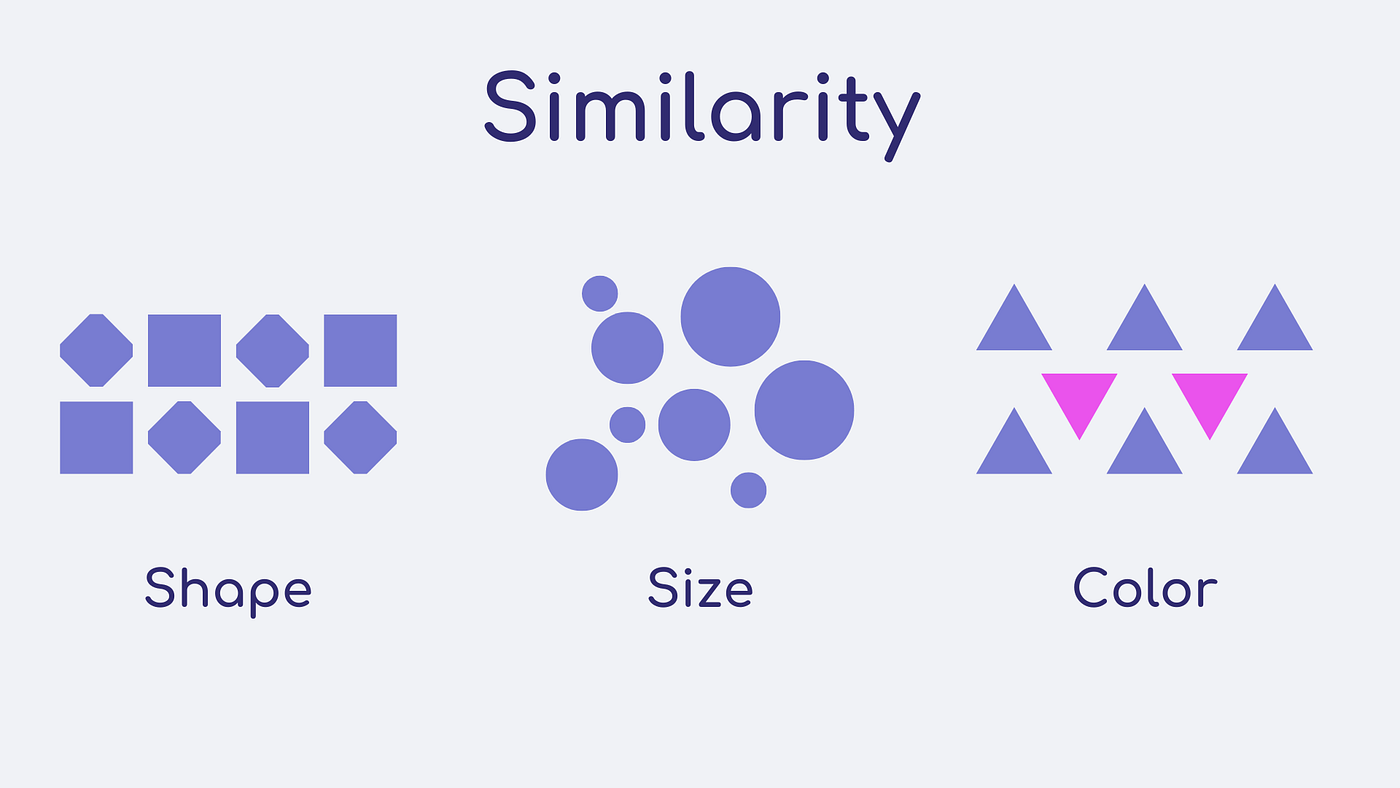
Figure 1.2: Similarity
2. Principle of Continuation
We follow the paths, lines and curves of a design, and prefer to see a
continuous flow of visual elements over separated objects.
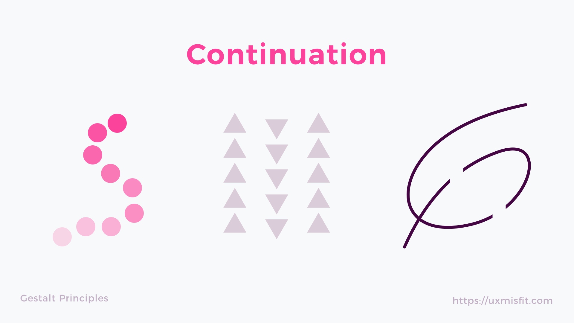
Figure 1.3: Continuation
3. Principle of Closure
Complete shapes are what we like to see. If the visual elements are not
complete, humans can perceive a complete shape by filling in missing visual
information.

Figure 1.4: Closure
4. Principle of Proximity
The process of ensuring related design elements are placed together. Any
unrelated items should be spaced apart. Close proximity suggested that
elements are connected or have a relationship to one another and become one
visual unit which helps to organise or give structure to a layout.

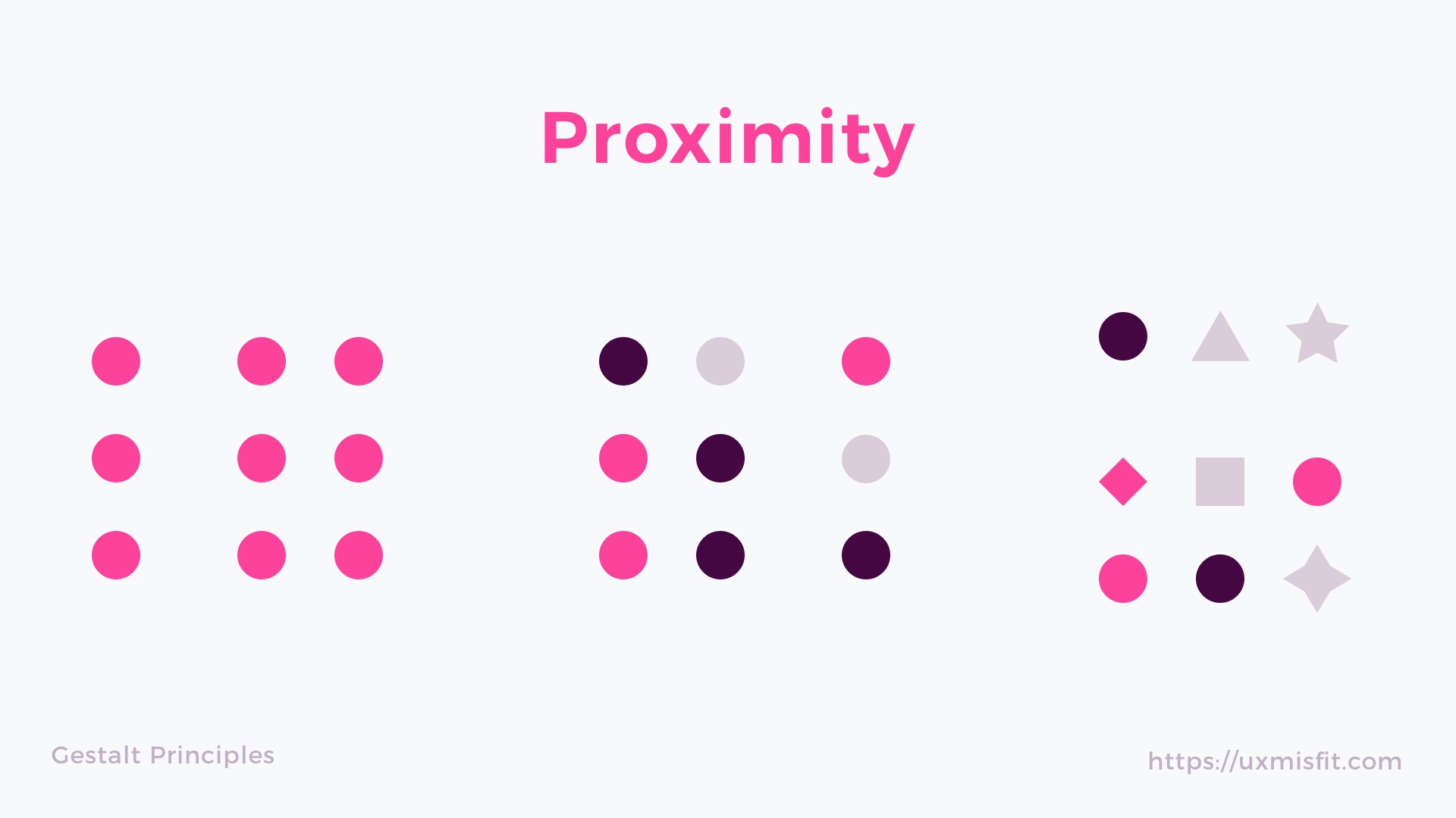
Figure 1.5: Proximity
5. Principle of Figure/Ground
Objects are naturally regarded as being in the foreground or background. They
either stand out in the foreground or blend into the background.
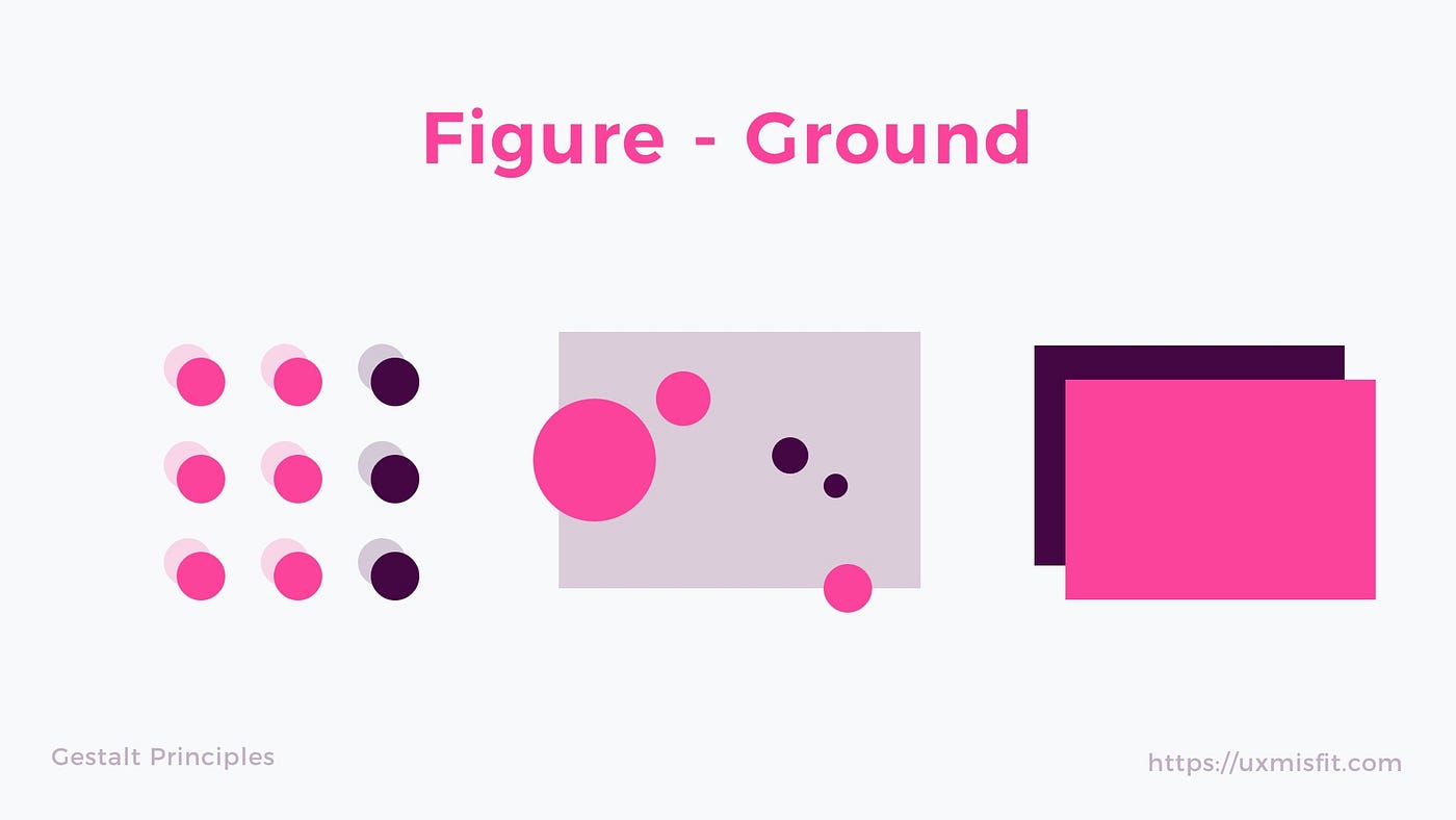
Figure 1.6: Figure/Ground
6. Law of Symmetry and Order
Elements that are symmetrical to each other tend to be perceived as a unified
group than objects not symmetrical with each other. Similar to the similarity
principle.
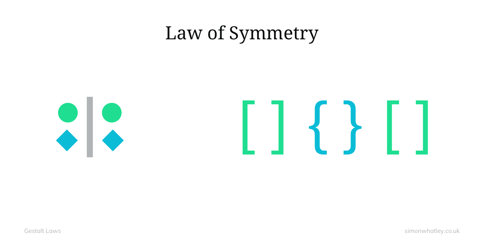
Figure 1.7: Symmetry
- Contrast
Contrast is the juxtaposition of strongly dissimilar elements. Visual
experience would be monotonous without contrast. Contrast can provide visual
interest, emphasise a point and express information.

Figure 1.8: Contrast
Lecture 2 - Balance and Emphasis
- Balance
It means distribution of visual weight in a work of design. The visual
equilibrium of the elements causes the whole image to look
balanced. Balance can be symmetrical or asymmetrical.


Figure 2.1: Balance

Figure 2.2: Balance
1. Symmetrical Balance
It means balance that is achieved by arranging elements on either side of
the centre of a composition in an equally weighted manner. It can be thought
of as a mirror image.
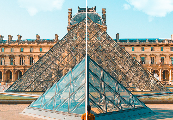 |
| Figure 2.3: Symmetrical Balance |
2. Asymmetrical Balance
A design need to have unequal visual weight on either side, but those
unequal visuals need to balance each other.

Figure 2.4: Asymmetrical Balance
3. The Golden Ratio
Golden Ratio is a mathematical concept. Humans perceived Golden Ratio as
the representative of perfect beauty over the centuries, also as a guide
to create visual balance. It brings harmony, balance and structure in
illustrations.
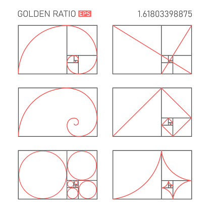
Figure 2.5: The Golden Ratio
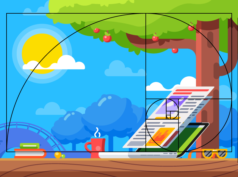
Figure 2.6: The Golden Ratio
4. Rule of Thirds
A composition guideline that places subjects in the left or right third of
an image.
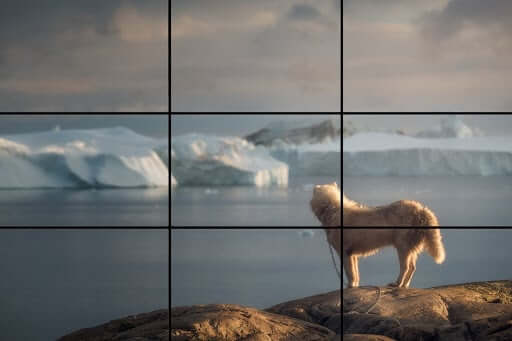
Figure 2.7: Rule of Thirds
- Emphasis
It is used to create dominance and focus in an artwork by using colours,
shapes or value.

Figure 2.8: Emphasis

Figure 2.9: Emphasis
Lecture 3 - Repetition and Movement
- Repetition
A design work with repetition may seem active as it brings rhythm and
pattern. Variety is important to make rhythms active and to avoid monotony.
Pattern brings visual excitement by enhancing surface interest.

Figure 3.1: Repetition
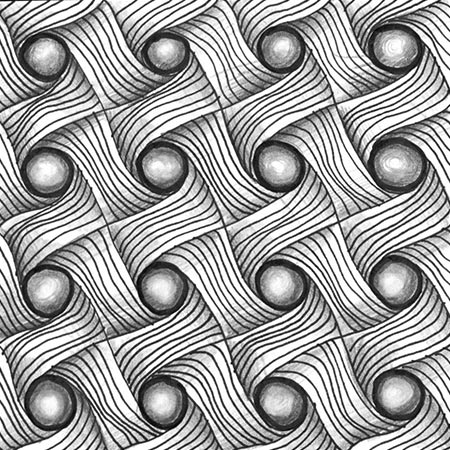
Figure 3.2: Repetition
- Movement
Movement happens when objects seem to be moving in a visual image.
Different kinds of shapes, forms, lines and curves are used to become
movement.

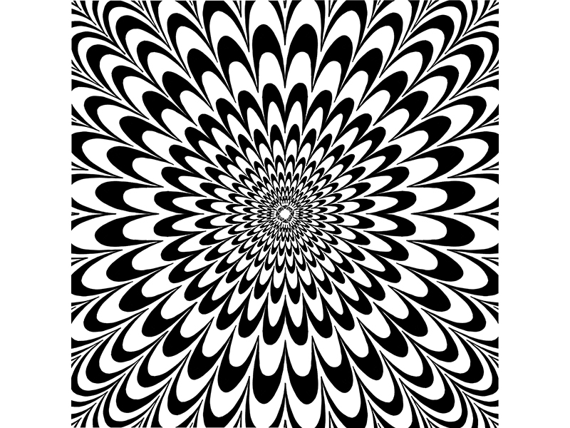
Figure 3.3: Movement
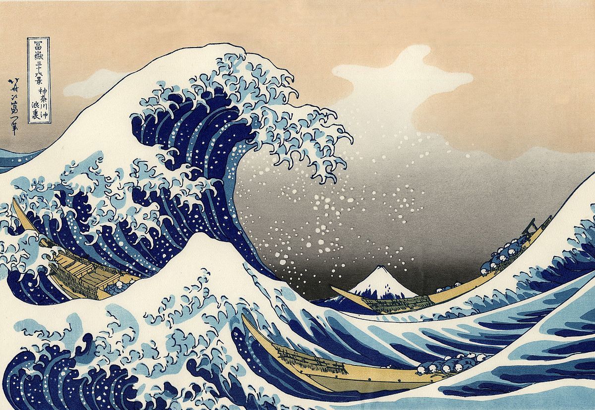
Figure 3.4: Movement
- Hierarchy
It is the choreography of content in a composition to express meaning
and information. Visual hierarchy indicates navigating through secondary
content and guides viewers to the most crucial information first.

Figure 3.5: Hierarchy
- Alignment
It creates a sense of unity and cohesion which makes the design's overall
aesthetic and perceived stability. Alignments leads us through a design.
It is the arrangement of elements so that their bodies follow a common
centre and their edges line up along common rows or columns.

Figure 3.6: Alignment
Lecture 4 - Harmony and Unity

Figure 4.1: Harmony and Unity
- Harmony
Choosing elements with common trait is a necessary step towards harmony.
Without variety, harmony becomes monotony. It is the sense that every
element of design fits together. They could have a same feeling, theme, or
aesthetic style.
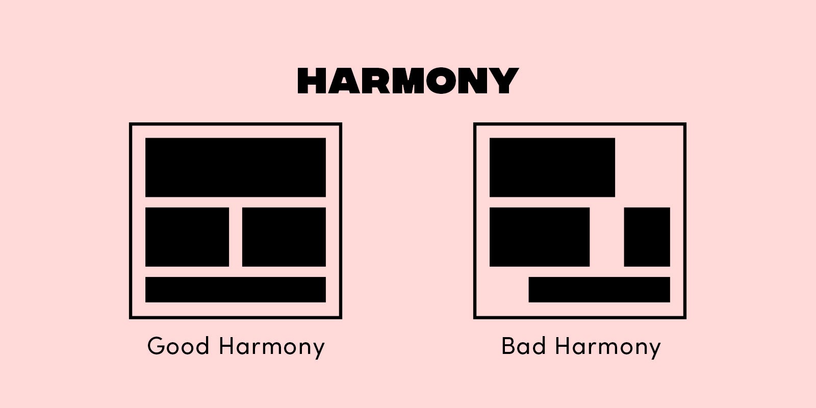
Figure 4.2: Harmony
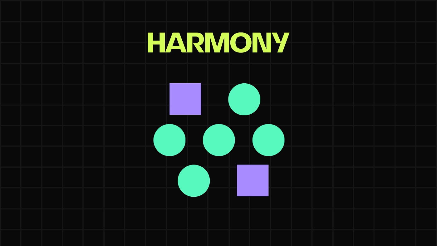
Figure 4.3: Harmony
- Unity
Unity happens when elements are used in a balance way to create theme
and pull the look together. Unity means the repetition of particular
elements throughout design.
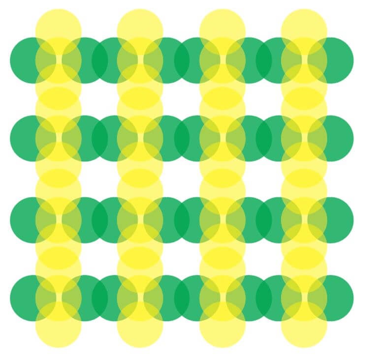
Figure 4.4: Unity
Figure 4.5: Unity
- Scale
Scale links to the size and dimension of an object in relation to other
objects.

Figure 4.6: Scale
- Proportion
Proportion is comparing size, colour, quantity, degree, setting. Design
with proportion results in harmony and unity.
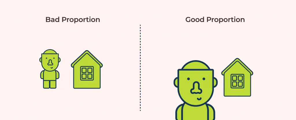
Figure 4.7: Proportion
Figure 4.8: Proportion
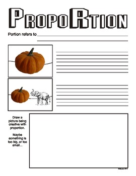
Figure 4.9: Proportion
Lecture 5 - Symbol, Word and Image
- Symbol
Figure 5.1: Symbol
- Word and Image
Typography is the arrangement of text to express messages. Choosing the
suitable typeface and images will result in visual hierarchy and balance in
a design.
Figure 5.2: Word and Image
Selected UNSDG Goal: 5. Gender Equality
We are required to select one UNSDG Goal from the United Nations' Sustainable
Development Goals (UNSDG). There are total 17 goals. The goal that I selected
is the fifth goal - Gender Equality.
This goal aims to achieve gender equality and empower all women and girls.
Selected work of design/art:
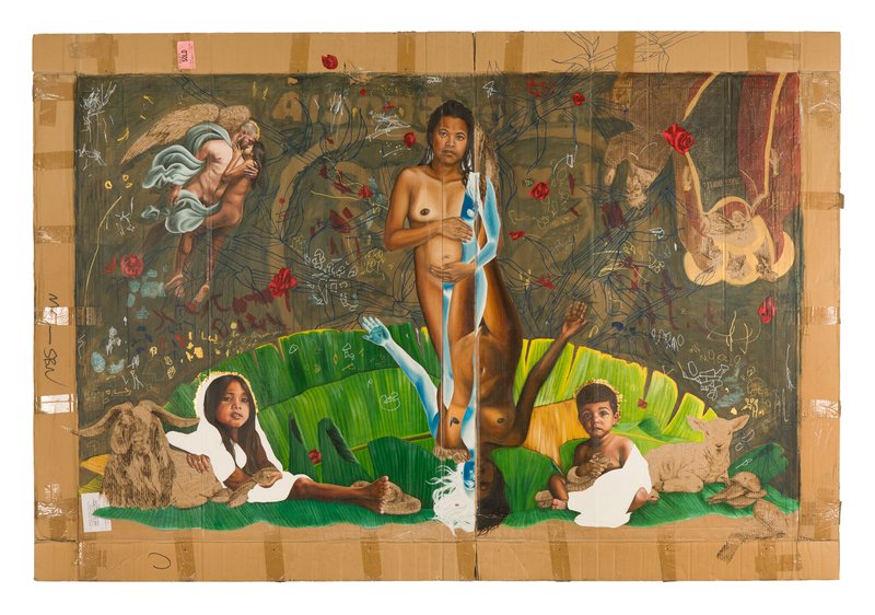 |
Original Sin by Marikit Santiago, 2018, acrylic, oil, pyrography and pen, 148cmx218cm |
Explanation:
The power of woman is immersed in the world. Despite women hold the power to
create life, gender inequalities are still deep-rooted in society. Women are
confronted by discrimination and inequality. The reason of choosing this
artwork is because it aligns with the fifth United Nations' Sustainable
Development Goals (UNSDG) "Gender Equality". This artwork sent a message about
human rights and peace to the world.
I am so lucky to have such a great family. I grew up in a good environment
with parents that always being supportive. They support and respect every
decisions that I made. As a female, I hope every female can be treated equally
with respect. With the aim of the UNSDG for Gender Equality, I hope that we
can solve gender equality problem someday and make a peaceful society, safer
living space and better environment in the world.
Design Principles: Emphasis, Harmony, Approximate Symmetry, Similarity, Proportion
FEEDBACK
Week 2: Write the reason of choosing the artwork in the explanation for selected artwork. Not just describe what you see in the artwork.
Week 3: Ms. Jinchi explained to me the difference of Symmetrical Balance and Asymmetrical Balance. Symmetrical Balance and Approximate Symmetry are also different, but very close.
REFERENCES
1. Structural transformation to support gender equity in the arts
Comments
Post a Comment