Click here to view Google Slides Idea Development, Design Direction, Execution and Post Production and submission.
Title: The Light Shine - The Romantic Overthinker
Artist Statement:
‘The light shine’ describes me in my everyday life. It represents an ability to illuminate even the darkest corners with optimism.It signifies someone’s joy and kindness. ‘The romantic overthinker’ represents my personality as a dramatic and emotional person. This also represents me as a person who is willing to regularly show how much I adore the object of my affection.
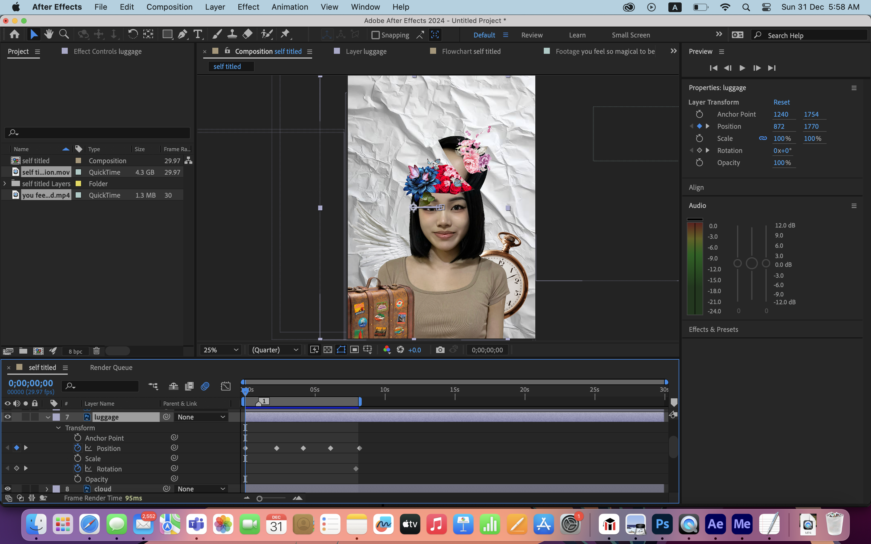
I chose white paper as background is to express life is like a blank sheet of paper. We create, explore and challenge new things every day. We lead our own life. The three different colours of pink stripes are my favourite colours that fits my personality. Someone who loves pink might be perceived as vibrant, cheerful and perhaps with a touch of romantic in their personality. The preference for pink could suggest an appreciation for beauty, warmth and a positive outlook in life. The flowers effect inside my head signifies that I’m emotional in relationships. The mosaic shape represents I am an imaginative thinker. The clock beside my portrait signifies I enjoy living my life and looking forward to living to the fullest of my life. I appreciate every people and things that happen around me. The luggage represents I love travelling and advocate freedom. The angel wing represents a sense of purity and a supportive person.
Overall, the purpose of my work is to tell story about my personality. In the process of doing this work, it reminds me that I am a special in the world. Everyone is special in their own way. I hope everyone around me becomes a cheerful person under the influence of my personality.
I first crop my portrait to be bigger and focus on the upper part. Then I cut my forehead to make the flower effect.
Figure 6.2: Photoshop flower effect
Figure 6.3: Progression in Photoshop
Figure 6.4: Progression of flower effect in Photoshop
Figure 6.5: Progression of Background in Photoshop
After adding the blank sheet paper as background, I use pen tool to cut the mosaic image in a round shape and add roses. I added three different pink stripes at the bottom.
Figure 6.6: Adding self portrait
After adding my self portrait with flower effect, I added some elements like clock, wings and luggage.
Figure 6.7: Element added in Photoshop
Then, I use the font that I designed and created in Typography. The title for the poster is "The Light Shine - The Romantic Overthinker".
Figure 6.8: Typography
Figure 6.9: Typography
Figure 6.10: First attempt
Figure 6.11: Second attempt
Mr.Hafiz told me to adjust the size of "The Romantic Overthinker". Make it larger.
Crop the self portrait to be bigger. Show more elements in the background. Mr.Hafiz said my work looks ok. Maybe "THE ROMANTIC OVERTHINKER" can be made bigger.


Comments
Post a Comment