25.9.2023 - 2.11.2023 ( Week 1 - Week 6 )
Gunn Joey / 0366122
Gunn Joey / 0366122
Typography / Bachelor of Design (Honours) in Creative Media / Taylor's
University
Task 1: Exercises
JUMPLINK
1. Lectures
2. Instructions
5. Animation
8. Feedback
9. Reflection
10. Further Readings
LECTURES
Week 1 :
Typo_0_Eportfolio Briefing
In the first lecture, Mr. Vinod explained to us the meaning of typography
and it is used and displayed in our daily life. Mr. Vinod taught us to
create e-portfolio with Blogger. We referred to few samples and video
tutorial. We followed the instructions that given by Mr. Vinod in the video
tutorial.
Typo_0_Introduction
- Font: The individual font or weight within the typeface.
- Typeface: The entire family of fonts / weights that share similar characteristics / styles.
Typo_1_Development
1. Early letterform development: Phoenician to Roman


Figure 1.1.2 Evolution from Phoenician Letter
- Tools for writing in those days are scratching into wet clay with a sharpened stick and carving into stone with a chisel.
- The forms of uppercase letterforms have evolved out of these tools and materials. Uppercase forms are simple combination of lines and circles.

Figure 1.1.3 Boustrophedon
- Phoenicians, they wrote from right to left.
- The Greeks changed the direction of writing which the the style is called 'boustrophedon'. They read alternately from right to left and left to right.

Figure 1.1.4 Early Letterform Development
- Etruscan and Roman carvers working in marble painted letterforms before inscribing them. The change in weight of their stroke is from vertical to horizontal.
2. Hand script from 3rd-10th century C.E.

- Square capitals : Written version can be found in Roman monuments. These letterforms have serifs added to the finish of the main strokes.

Figure 1.2.2 Late 3rd - Mid 4th century: Rustic
capitals
- Rustic capitals : A compressed version of square capitals, allowed for twice as many words on a sheet of parchment and took far less time to write. This letterform is faster and easier but were slightly harder to read due to its compressed nature.

Figure 1.2.3 4th century: Roman cursive
-
Roman cursive : Written for everyday transactions which forms were simplified for speed. This is the beginning of lowercase letterforms.

Figure 1.2.4 4th-5th century: Unicials
- Unicials incorporated some aspects of the Roman cursive hand (A, D, E, H, M, U, and Q) which is used simply as small letters or lowercase.

Figure 1.2.5 C. 500: Half-inicials
- Half-uncials mark the formal beginning of lowercase letterforms, replete with ascenders and descenders, 2000 years after the origin of the Phoenician alphabet.

Figure 1.2.6 C. 925: Caloline miniscule
-
Charlemagne, the first unifier of Europe since the Romans. The monks rewrote the texts using both majuscules, minuscule, capitalization and punctuation.
3. Blackletter to Gutenberg's type

Figure 1.3.1 C. 1300: Blackletter
(Textura)
- Textura : A condense strongly vertical letterform in northern Europe.
- Rotunda : A rounder more open hand gained popularity in the south Europe.

Figure 1.4.1 Text type
classification
Week 2 :
Typo_3_Text_Part1
1. Kerning and Letterspacing
- Kerning : Automatic adjustment of space between letters.

Figure 2.1.1 Kerning
- Tracking : The addition and removal of space in a word or sentence.
Figure 2.1.2 Tracking
- Letterspacing : To add space between letters.
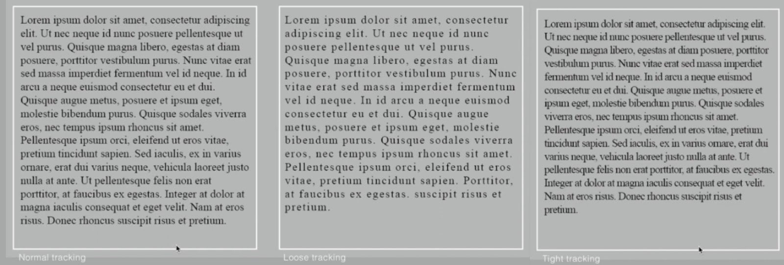
Figure 2.1.3 Letterspacing
2. Formatting Text
- Flush left : Closely mirrors the asymmetrical experience of handwriting. Each line starts at the same point but ends wherever the last word on the line ends.

Figure 2.2.1 Flush left
-
Centered : Imposes symmetry, equal value and weight to both ends of any line. It transforms fields of text into shapes, thereby adding a pictorial quality. Centered type creates such a strong shape on the page, it's important to amend line breaks so that the text does not appear too jagged.
 Figure 2.2.2 Centered
-
Flush right : Places emphasis on the end of a line as opposed to its start. It can be useful in situations (like captions) where the relationship between text and image might be ambiguous without a strong orientation to the right.
 Figure 2.2.3 Flush right


- Justified : Imposes a symmetrical shape on the text, by reducing or expanding spaces between text or letter.

Figure 2.2.4 Justified
3. Texture
Different typefaces suit different messages. Knowing which
typeface best suits the message is very important. Type with a
relatively generous x-height or relatively heavy stroke width
produces a darker mass on the page than type with a relatively
smaller x-height or lighter stroke.

Figure 2.3 Texture
4. Leading and Line Length
- Type size : Text type should be large enough to be read easily at arms length.
- Leading : Text that is set too tightly encourages vertical eye movement.
- Line Length : Appropriate leading for text is as much a function of the line length as it is a question of type size and leading. A good rule of thumb is to keep line length between 55-65 characters.
5. Type Specimen Book
A type specimen book shows samples of typefaces in various
different sizes. Without printed pages showing samples, it is
hardly to make any choice of type. A type specimen book (or
ebook for screen) is to provide an accurate reference for
type, type size, type leading, type line length etc.

Figure 2.5 Type specimen Book
- Compositional Requirement : Text should create a field that can occupy page or a screen.
Week 3 :
Typo_3_Text_Part2
- Pilcrow : To indicate paragraph spacing.

Figure 3.1.1 Pilcrow
-
Line Space : If the line space is 12pt, then the paragraph
space is 12pt, same as leading between paragraph.

Figure 3.1.2 Line space
- Standard Identation : It is equivalent to the line spacing and point size of text.


Figure 3.1.3 Standard Identation
- Extended Paragraph : Creates unusually wide columns of text.

Figure 3.1.4 Extended Paragraph
2. Widows and Orphans
- Widow : A short line of type left alone at the end of a column of a text.
- Orphan : A short line of type left alone at the start of new column.

Figure 3.2 Widows and Orphans
3. Highlighting Text
- Different kinds of emphasis require different kinds of contrast.

Figure 3.3.1 E
xample of Text Highlight
- In this example the sans serif font (Univers) has been reduced by 0.5 to match the x-height of the serif typeface of 8.

Figure 3.3.2 Example of Reduced The Sans Serif Font (Univers)
- Aligned figures (numbers) or All Capital acronyms embedded in text by 05 as well, to ensure visual cohesion of the text.

Figure 3.3.3 Example of Reduce size of text to ensure visual cohesion of text
- When highlighting text by placing colour at the back of the text, maintaining the left reading axis (right example) of the text ensures readability is as its best.

Figure 3.3.4 Example of Highlighted Text Through Coloured Background
- Placing certain typographic elements outside the left margin of a column of type ( extending as opposed to indenting) to maintain a strong reading axis.

Figure 3.3.5 Example of Typographic elements outside the left margins
- Quotation marks, like bullets, can create a clear indent, breaking the left reading axis. Compare the intended quote at the top with the extended quote at the bottom.

Figure 3.3.6 Example of Using Quotation Marks
4. Headline within text
- A head indicates a clear break between the topics within a section

Figure 3.4.1 'A' head
- B head is subordinate to A head. B head indicate a new supporting arguments or examples for the topic at hand.

Figure 3.4.2 'B' head
- C head highlight specific facets of material within B head text, not materially interrupt the flow of reading

Figure 3.4.3 'C' head
5. Text / Cross Alignment
- Aligning headlines and captions with text type enhances the page's architectural structure and reinforces its vertical rhythms.

Figure 3.5.1 Example of Cross Alignment of text
- Below, one line of headline type aligns with two lines of text type, and on the bottom left, four lines of headline type align with five lines of text type.

Figure 3.5.2 Example of Cross Alignment of text
Week 4 :
Typo_2_Basic
Basic / Describing Letterforms
- Baseline : Imaginary line the visual base of the letterforms
- Median : Imaginary line defining the x-height of letterforms
- X-height : Height in any typeface of the lowercase 'x'

Figure 4.1.1 X-height
- Stroke : Any line that defines the basic letterforms

Figure 4.1.2 Stroke
- Apex / Vertex : The point created by joining two diagonal stems (apex for above and vertex for below)

Figure 4.1.3 Apex / Vertex
- Arm : Short strokes off the stem of the letterform, either horizontal or upward

Figure 4.1.4 Arm
- Ascender : Stroke that exceed the median line

Figure 4.1.5 Ascender
- Barb : Half finish on some horizontal arms

Figure 4.1.6 Barb
- Beak : Half-serif finish on some horizontal arms
- Bowl : Rounded form describes a counter, may be open or closed

Figure 4.1.7 Bowl
- Bracket : Base of the letterform

Figure 4.1.8 Bracket
- Cross Bar : Connect two stem stroke
- Cross Stroke : Stroke that joins two stems together (found in lowercase letter f and t)

Figure 4.1.9 Cross Stroke
- Crotch : Interior space where two strokes meet

Figure 4.1.10 Crotch
- Descender : Anything below baseline

Figure 4.1.11 Descender
- Ear : Stroke extending out from the main stem

Figure 4.1.12 Ear
- Em : Distance equal to the size of the typeface
- En : Half of the em
- Finial : Rounded non-serif terminal to a stroke

Figure 4.1.13 Finial
- Leg : Short stroke off the stem of the letterform

Figure 4.1.14 Leg
- Ligature : Character formed by the combination of two or more letterform

Figure 4.1.15 Ligature
- Link : Stroke that connects the bowl and loop of a lowercase letter 'g'

Figure 4.1.16 Link
- Loop : Bowl created in the descender lowercase letter 'g'

Figure 4.1.17 Loop
- Serif : Right-angled foot at the end of the stroke

Figure 4.1.18 Serif
- Shoulder : Curve stroke that is not part of a bowl

Figure 4.1.19 Shoulder
- Spine : Curve stem of the letter 'S'

Figure 4.1.20 Spine
- Spur : Extension the articulates the junction of the curved and rectilinear stroke

Figure 4.1.21 Spur
- Stem : Significant vertical or oblique stroke

Figure 4.1.22 Stem
- Stress : Orientation of the letterform, indicated by the thin stroke in round forms

Figure 4.1.23 Stress
- Swash : Flourish that extends the stroke of the letterform

Figure 4.1.24 Swash
- Tail : Curved diagonal stroke at the finish of certain letterform

Figure 4.1.25 Tail
- Terminal : Self-contained finish of a stroke without a serif

Figure 4.1.26 Terminal
2. The Fonts
- Uppercase capital letters

Figure 4.2.1 Uppercase capital letters
- Lowercase letters

Figure 4.2.2 Lowercase letters
- Small capitals
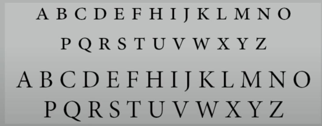
Figure 4.2.3 Small capitals
- Uppercase numerals

Figure 4.2.4 Uppercase numerals
- Lowercase numerals

Figure 4.2.5 Lowercase numerals
- Italic and Roman

Figure 4.2.6 Difference of Italic and Roman

Figure 4.2.7 Difference of Italic and Roman
- Punctuation, Miscellaneous character

Figure 4.2.8 Punctuation, Miscellaneous character
- Ornaments

Figure 4.2.9 Ornaments
3. Describing Typefaces
- Roman : The uppercase forms are derived from inscriptions of Roman monuments. A slightly lighter stroke in roman is known as "Book".
- Italics : Named for 15th century Italian handwriting on which the forms are based.
- Oblique : conversely is based on the roman form of typeface.
- Boldface : Characterised by a thicker stroke than a roman form. It can also be called 'semibold', 'medium', 'black', 'extra bold', or 'super'.
- Light : A lighter stroke than the roman form. Even lighter strokes are called 'thin'.
- Condense : A version of the roman form, and extremely condense styles are often called 'compressed'.
- Extended : An extended variation of a roman font.
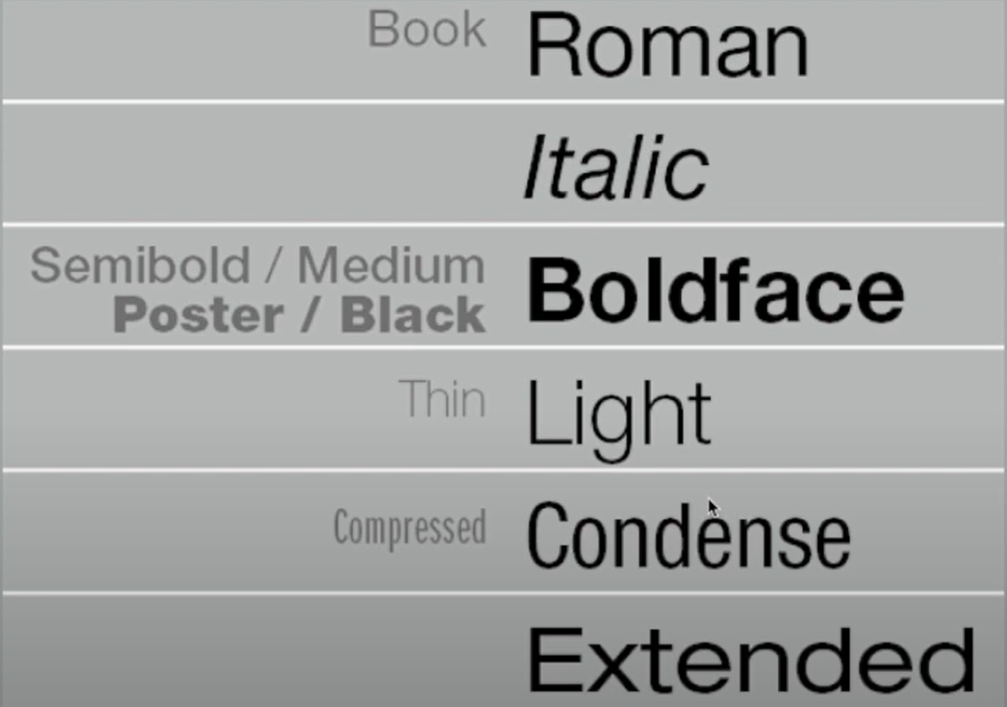
Figure 4.3 Typefaces
4. Comparing Typefaces

Figure 4.4.1 Examples of 10 Typefaces
The 10 typefaces represents 500 years of type design. There are two goals for these typefaces: easy readability and an appropriate expression of contemporary esthetics. These typefaces have remained in use for decades, and in some cases, even centuries. They were considered successful expressions of how we think, read, write and print.

Differences in x-height, line weight, forms, stroke widths and in feeling. Feelings connote specific use and expression. Examining typefaces allows us to know how we feel about certain types, and also see the appropriateness in type choices.
Week 5:
Typo_5_Understanding
- The uppercase letter forms below is not symmetrical. It is easy to see the two different stroke weights in the Baskerville stroke form; more noteworthy is the fact that each bracket connecting the serif to the stem has a unique arc.

Figure 5.1.1
Baskerville 'A'
- The uppercase letter forms may appear symmetrical but the width of the left slope is thinner than the right stroke. Both Baskerville and Univers demonstrates the meticulous care a type designer takes to create letterform that are both internally harmonius and individually expressive.

Figure 5.1.2
Univers 'A'
2. Letters
- The complexity of each individual letterforms is neatly demonstrated by examining the lowercase 'a' of two seemingly similar sans-serif typefaces (Helvetica and Univers). Differences between how the stems of the letterform finish and how the bowls meet the stem quickly reveals the palpable difference character.
 |
| Figure 5.1 Helvetica vs Univers |
2. Maintaining X-height
- X-height describe the size of the lowercase letterforms.
- Curved strokes, such as in 's', must rise above median (or sink below the baseline) to be the same size as the vertical and horizontal strokes they adjoin.

Figure 5.2 X-height
3. Letters / Form / Counterform
- The space describes and is often contained, by the strokes of the form.
- When letters are joined to form words, the counterform includes the spaces between them.
- To understand the form and counter of a letter, examine them in close detail. The examination also provide a good feel for how the balance between form and counter is achieved and a palpable sense of letterform's unique characteristics.
4. Contrast
 |
| Figure 5.4 Contrast |
Week 6:
Typo_6_Screen and Print
1. Print Type vs Screen Type
- Type for Print
Typefaces for print are Caslon, Garamond, Baskerville. They are the most common typefaces that is used for print. Because of their characteristic which are elegant and intellectual but also highly readable when set at small font size.
Figure 6.1 Type for print
- Type for Screen
Typefaces intended for use on the web are optimized and often modifies to enhance readability and performance on-screen in a variety of digital environments. This can include a taller x-height or reduced ascenders and descenders, wider letterforms, more open counters heavier thin strokes and serifs, reduced stroke contrast, modified curves and angles.
 |
| Figure 6.2 Type for screen |
3. Hyperactive Link / Hyperlink
- A hyperlink is a word, phrase, or image that you can click on to jump to a new document or a new section within the current document. Hyperlinks can be found on nearly all web pages. Text hyperlinks are normally blue and underlined by default.
4. Font Size for screen
- 16-pixel text on a screen is about the same size as text printed in a book or magazine, accounting for reading distance. Printed text in a book or magazine is typically set at about 10 points. If reading them at arm’s length, at least set at about 12 points, which is about the same size as 16 pixels on most screens.
 |
| Figure 6.4 Font size on screen vs print |
5. System Fonts for Screen / Web Safe Fonts
- Each device comes with its own pre-installed font selection which is based largely on its operating system. Each system font such as Windows, macOS and Android system may differ a little bit and not be compatible with each other. However, this is no longer an issue as it has been solved to avoid inconvenience.
- Web safe appears across all operating systems. They are the small collection of fonts that overlap from Windows to Mac to Google.
- 'Web safe' : Open Sans, Lato, Arial, Times New Roman, Times, Courier New, Courier, Verdana, Georgia, Palatino, Garamond
6. Pixel Differential between Devices
- The screens used by PCs, tablets, phones and TVs are different in size and proportion because they have different-sized pixels of the screens. Even within a single device class, there will be a lot of variation.

INSTRUCTIONS
<iframe src="https://drive.google.com/file/d/1vcTAnYWvvOhoBxg3NByNCmPLWoi9CRH2/preview" width="640" height="480" allow="autoplay"></iframe>
Task 1 : Exercise 1 - Type Expression
Mr. Vinod gave us a list of words to select in Microsoft Teams. We are
required to choose four words and sketch our ideas on paper and upload it on
our own blog. The words that I sketched are fire, freeze, cry and gun.
1. Sketches

Figure 7.1 Sketches of my Type Expressions - Week 1 (25.9.2023)
After getting feedback from Mr.Vinod, I realised that my sketch needs a lot of improvement. We are not allowed to use too much of illustration in typography sketch. All my sketches with illustration are unnecessary.
2. Digitalisation
We are required to use 10 typefaces that given by Mr.Vinod in Google drive to create type expressions. Choose the suitable typefaces that match with our sketches.
.jpg)
Figure 7.2.2 Static Type Expression (PDF) - Week 2 (2.10.2023)
We are supposed to animate a word using Illustrator and Photoshop. I chose "Freeze".

Figure 7.3.1 Progress of Animation using Adobe Illustrator - Week 3 (9.10.2023)
I watched the lecture video for animation to animate the word. Firstly, I paste few artboards to create a gradient outcome for "Freeze" in Photoshop.

Figure 7.3.2 Final Animation Timeline (12 Frames) - Week 3 (9.10.2023)
I ended up using 12 frames for "Freeze" animation.

Figure 7.3.3 Final Animation (GIF) - Week 3 (9.10.2023)
Task 1 : Exercise 2 - Type Formatting
1. Lecture 1/4 of Text Formatting: Kerning and Tracking
For exercise 2, we are required to use Adobe InDesign to create one final layout including alignment, kerning, leading, paragraph spacing and more.
Figure 8.1.1 without kerning - Week 4 (16.10.2023)
Figure 8.1.2 with kerning - Week 4 (16.10.2023)
2. Lecture 2 to 4 of Text Formatting
Following the lecture videos, this is my final layout.
HEAD
Font/s : Univers Ltd Std
Type Size/s : 20 pt, 24 pt, 40 pt
Leading : 44 pt
Paragraph spacing : 44 pt
BODY
Font : Bodoni Std
Type size : 11pt
Leading 11 pt
Paragraph spacing : 11 pt
Character per-line : 45
Alignment : Left align
Margins : 12.7 mm top + 12.7 mm right + 12.7 mm left + 12.7 mm bottom
Columns : 4
Glutter : 5mm
Figure 8.2.2 Text formatting layout (with grids) - JPEG
Figure 8.2.3 Text formatting layout (without grids) - PDF
Figure 8.2.4 Text formatting layout (with grids) - PDF
FEEDBACK
WEEK 1 :
General feedback: Complete the lectures.
Specific feedback: Simple and clean sketches will make better idea.
WEEK 2 :
General feedback: Watch lecture videos for digitalisation.
Specific feedback: Use only the
fonts that downloaded in Google Drive.
WEEK 3 :
General feedback: Complete the digitalise animation with Illustrator. Make
sure to update all lectures on time.
Specific feedback: Add dates and labels for all figures in E-portfolio.
WEEK 4 :
General feedback: Watch lecture video for animation. Create animation
using Photoshop and Illustrator.
Specific feedback: Use only the 10 typefaces. Mr. Vinod told me that my exercises are not using the given fonts. Make sure to re-do it ASAP with the fonts that downloaded in Google Drive.
WEEK 5 :
General feedback: Use InDesign to complete Text Formatting. Update my further reading and mention date on that part.
Specific feedback: Adjust the spacing and make sure the text is neat. Adjust the point size for body text.
REFLECTION
Experience :
This is my first time learning to make a e-portfolio using Blogger. I tried
out Adobe Illustrator, Photoshop also for the first time. Great experience
to explore more about typography.
Observations :
I observed that I do better lectures when I'm listening to music. I feel
relax and not so stress. I noticed that my digitalisation needs more
improvement.
Findings :
I found that I can't easily get good ideas in sketching. In the process of completing all the exercises using Photoshop, Illustrator and InDesign, I need to be more patient and focus during listening to lecture videos. I'm too careless as I use the wrong fonts in all exercises. This caused me taking more time to complete them all again.
FURTHER READINGS

Figure 9.1 Typography Design : Form and Communication
We are required to do further readings for typography. From the list that
given by Mr. Vinod, I choose this book, "Typography Design : Form and
Communication".
Typography participates in a history of visual communication extending
thousands of years. It begins with the invention of writing over five
thousand years ago and ends with the invention of movable type in Europe
during the middle of the fifteenth century.
In the second section, Gutenberg's invention of movable type lasted about
350 years. In the third section, the Industrial Revolution and nineteenth
century are revealed as an era of technological innovation and new
typographic forms. The fourth section begins with the year 1900. The final
section is in the twenty-first century.
The book covers essential topics such as the history and classification of typefaces, as well as technical aspects like kerning, leading. Mr. Vinod taught us before in lecture videos. It emphasizes the crucial role typography plays in visual communication, highlighting how letterforms impact design and convey messages effectively. In lectures that given by Mr.Vinod, there are explanation for typeface selection, spacing, and font size. They are included in this book. It emphasizes the importance of readable typography in effective communication, both in print and digital media. Through practical examples and guidelines, I gain insights into creating typographic designs that are easily readable.
Typography grids serve as a structured layout system, providing guidelines for organizing text and other design elements on a page. The book covers various grid systems, explaining their principles and applications in typographic design. By studying these grids, I learn how to create balance and visually appealing layouts, enhancing the overall readability and aesthetic of typographic compositions.
Comments
Post a Comment